
Whitehot Magazine
July 2026
"The Best Art In The World"
"The Best Art In The World"
July 2026
Rooted in a Sense of Place: An Interview with Sammi Lynch by Phillip Edward Spradley - New York
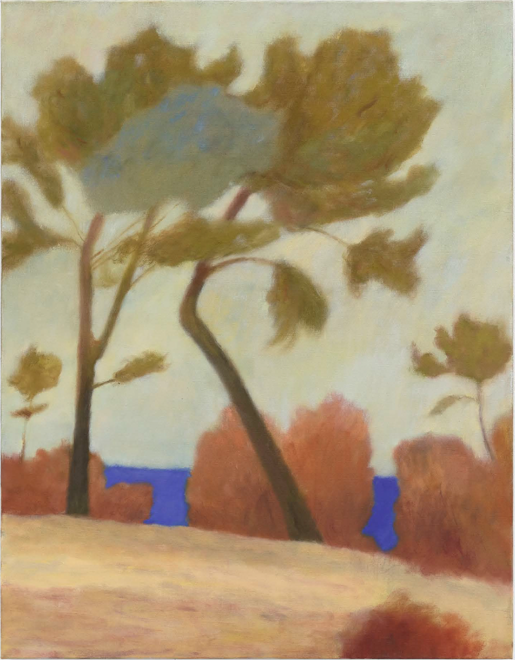 The Tree’s Call Out, 2024. Oil on linen. 36 1/4 x 28 x 1 1/2 in. (92 x 71 x 4 cm.) Courtesy of Scroll NYC.
By PHILLIP EDWARD SPRADLEY May 27, 2025
Sammi Lynch is a London-based artist whose practice explores the emotional and psychological dimensions of landscape. Her process often begins with pastel drawings made directly from life—intuitive responses to specific environments that capture more than surface detail. These works on paper serve as foundations for larger paintings and prints that investigate how memory, seasonality, and personal experience inform our perception of place. By repeatedly revisiting the same sites, Lynch builds a layered visual archive of shifting light, mood, and atmosphere, transforming familiar locations into spaces of reflection and emotional resonance.
Lynch’s landscapes are defined by expressive brushwork, bold color, and richly textured surfaces. Rather than seeking objective representation, her compositions convey how the external world mirrors internal states. Light, space, and texture become vehicles for exploring the interplay between observation and feeling. Though grounded in real geographies, her imagery resists specificity, offering viewers scenes that are both deeply personal and broadly relatable. Lynch studied at Manchester School of Art, Kingston School of Art, and the Royal Drawing School. Her work has been exhibited at Annely Juda Fine Art, Blue Shop Gallery, and Lychee One in London, as well as Solito Gallery in Naples, among others.
She is currently featured in the exhibition 'Entangled Roots' at Scroll Gallery in New York City, on view through May 31st.
Phillip Edward Spradley: Your process often begins en plein air, working directly from life. What draws you to this approach, and why does it feel essential to your practice?
Sammi Lynch: I enjoy the rhythm of going out into the landscape, working with the weather or the changing light, and returning with a drawing that can communicate with others or that will sustain me in my studio until my next excursion. There is an immediacy and intimacy in making work from life that I find deeply engaging - It forces me to really look, and through doing so I form a deeper relationship with my subject.
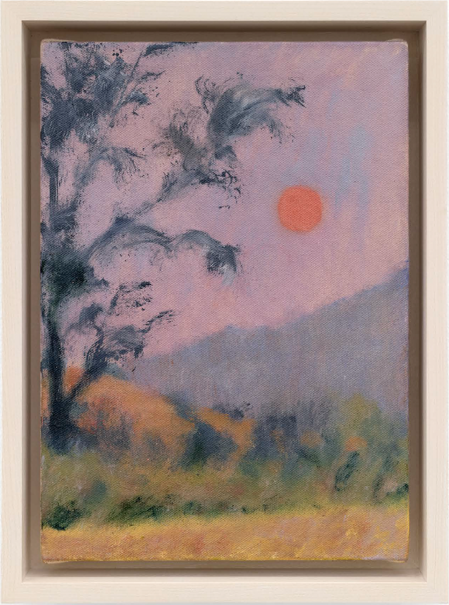 Waiving to the Water, 2025, Oil on linen, mounted on wooden panel. Canvas: 8 1/2 x 6 x 1/2 in. (21.5 x 15 x 1 cm.) Framed: 9 3/4 x 7 1/4 x 1 1/2 in. (24.8 x 18.4 x 3.8 cm.) Courtesy of Scroll NYC.
How do your initial drawings evolve into paintings or prints, and how do you navigate the shift between these mediums?
Sometimes if there's a drawing that I'm really happy with, I won’t want to make painting from it because it's almost too high of a bar for a painting to stand up to. I find it more useful to work from a less resolved drawing or alternatively I might use two or three drawings of a similar subject, perhaps made at the same time in the same landscape, these then end up getting woven together into a painting.
I make some monochrome drawings which are useful in the studio to give me more of a compositional lead. Back in the studio there's space for me to try and make sense of the marks in paint. I often have another drawing alongside that acts as more of a reference of palette and mark making. The drawings tend to capture a sense of immediacy that I can lose whilst making a painting in the studio. So, having the drawings there as a reference point helps to keep that feeling of instinctively made decisions.
You often revisit the same locations over time. What role does repetition play in your work — both as a technical discipline and as a way of deepening your emotional relationship to a place?
I think it gives me a sense of how I’m changing as a person which I find it interesting. Returning after a period of time to a place I’ve made drawings from can slightly distort the relationship I thought I had that place because of the relationship I’ve developed with those drawings in the intervening time. I get there again and I’m expecting this kind of half-imagined world that the drawings have developed into. The space is familiar in a way that I might not expect.
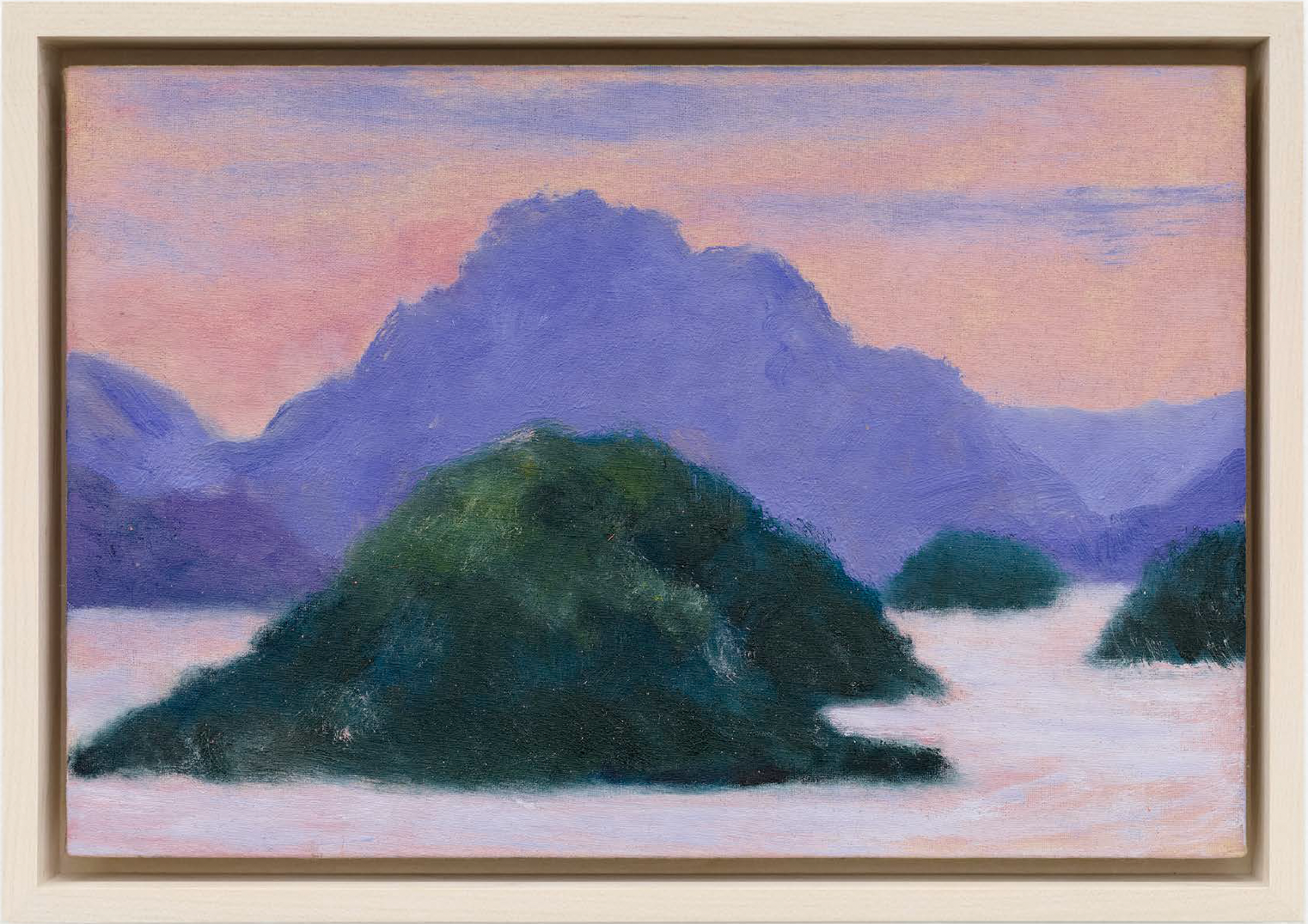 Islands, 2025. Oil on canvas, mounted on wooden panel. Canvas: 7 3/4 x 11 3/4 x 1/2 in. (20 x 30 x 1 cm.) Framed: 9 1/4 x 13 1/8 x 1 1/2 in. (23.5 x 33.3 x 3.8 cm.) Courtesy of Scroll NYC.
You’ve lived between rural and urban environments — the northwest of England and now London. How have these different landscapes shaped your artistic voice and sensibility?
When I was on ‘The Drawing Year’ we did a lot of drawing in the city. There was a really good class on the banks of the Thames and we drew each week at a different point on the river. I feel compelled to draw when I'm out and about. I don't necessarily feel compelled to make work of London at the moment, but when I was in New York for a few days last month I wanted to paint skyscrapers and the subways. All I could think of are those amazing early works of Mark Rothko.
In your work, there’s a quiet sense of time passing — seasonally, emotionally, even spiritually. Do you think of painting as a way to hold or slow down time?
Drawing and painting are wonderful ways to document the passing of time - is not just about depicting what I see, but also about depicting the experience of time itself, capturing its flow and its impact on the world and human relationships.
I enjoy the physicality of painting - the time it takes preparing the surface. Stretching the canvases and then applying layers of rabbit skin glue. Just watching the glue dry slows me down, I spend this time anticipating the painting to come. With some of the paintings I feel like a lot of the work is happening before I have a brush in my hand. I'll have made the drawings, prepared the surface, and then I will paint quite intensely for a couple of days. To keep the richness of the mark on the fabric you have to be quite decisive. Some parts of the painting are worked fairly thinly, whereas some areas I'll rework a few times. In other peoples paintings I like to see the areas that have been reworked, it gives an insight into some of the journey the work has been through.
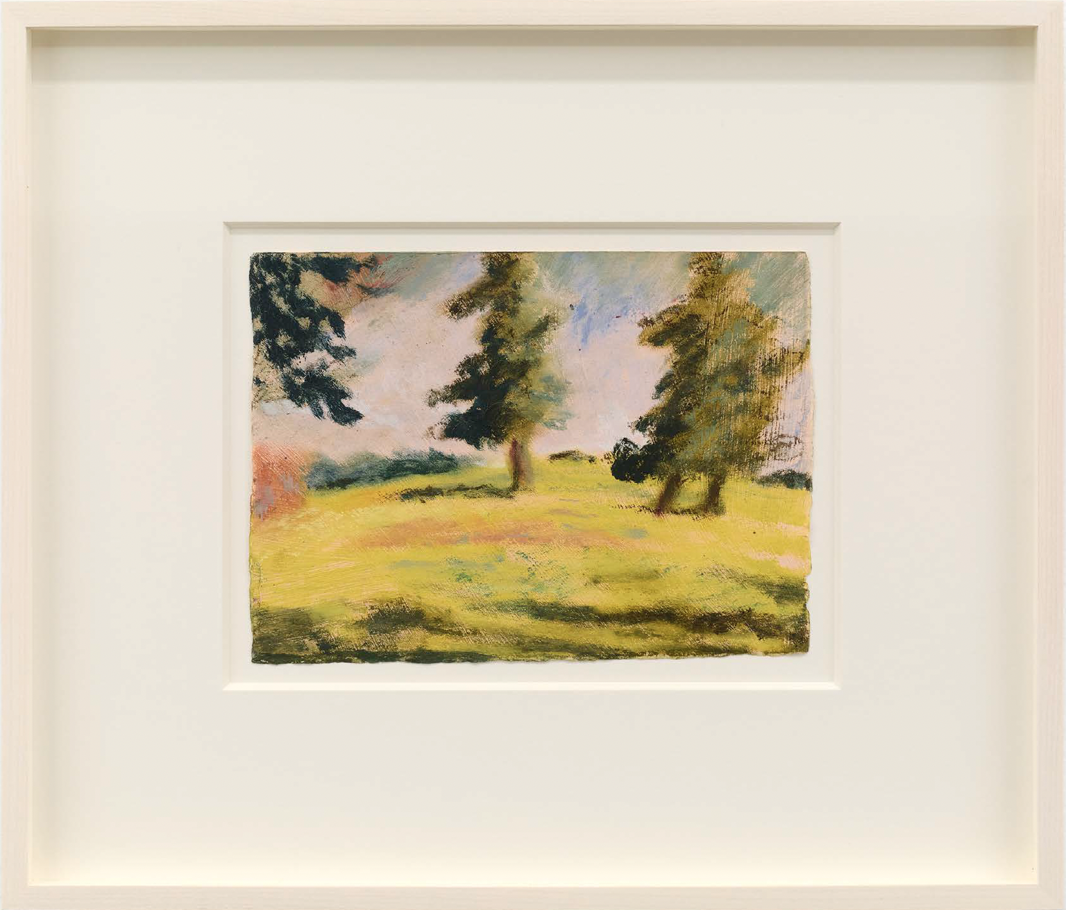 Trees in the Sunlight, 2023. Pastel on paper. Sheet: 5 1/2 x 7 1/2 in. (14 x 19 cm.) Framed: 12 x 13 7/8 x 1 1/2 in. (30.5 x 35.2 x 3.8 cm.) Courtesy of Scroll NYC.
Can you talk about your relationship to color? Your palette often feels both grounded in nature and subtly heightened—what guides your color choices, and do you ever find yourself surprised by them?
I think generally I'm looking for local color in the landscape, an existing colour that I can see, then either tuning it up or down depending on what the drawing or painting is asking for.
I’m inspired by painters like Milton Avery; although he was often using flat areas of color, there was a real sense of depth in what he was painting. He would do things like shift the warmth of a blue to give the illusion of depth in a landscape.
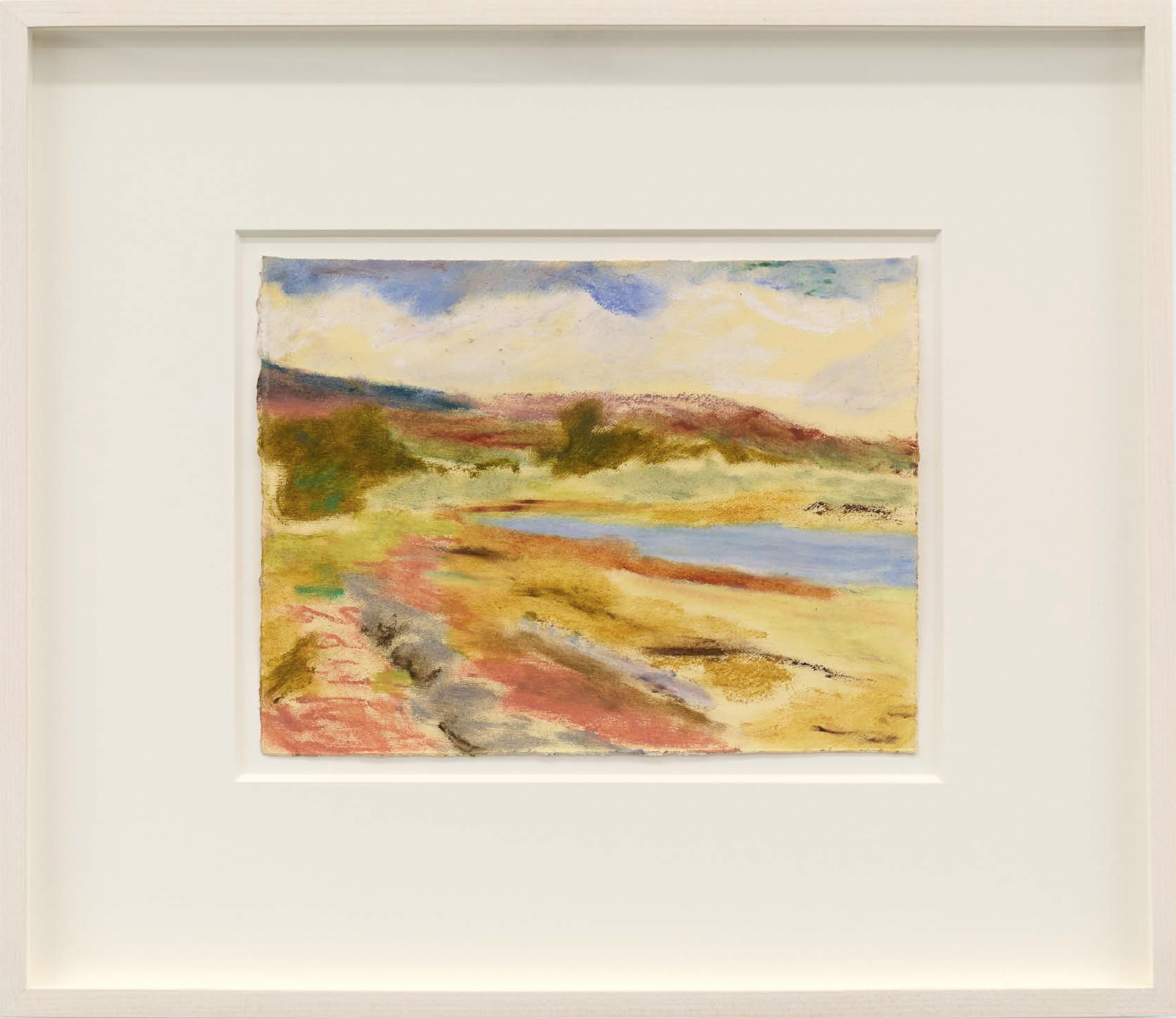 The Coast, 2024. Pastel on paper. Sheet: 6 1/4 x 8 1/4 in. (16 x 21 cm.) Framed: 12 5/8 x 14 5/8 x 1 1/2 in. (32.1 x 37.1 x 3.8 cm.) Courtesy of Scroll NYC.
Do you consider your landscapes to be fixed locations, or do they function more as accumulations—of memories, weather, mood, and change?
Some of the paintings definitely feel like they're in-between places. I remember the first time I painted a particular hillside in Spain—I was referencing a drawing I had made there. But the week before, I’d been in North Wales, at a place called Horseshoe Pass, which had a similarly winding road that curved around a hill. So, even though the composition came from the Spanish hillside drawing—which was monochrome—I noticed that some of the colours in the painting felt distinctly Welsh. It was like part of my mind was still with that hillside in Wales. The drawings aren't literal representations of place; they're infused with my experience, memory, and whatever else I’ve been carrying with me.
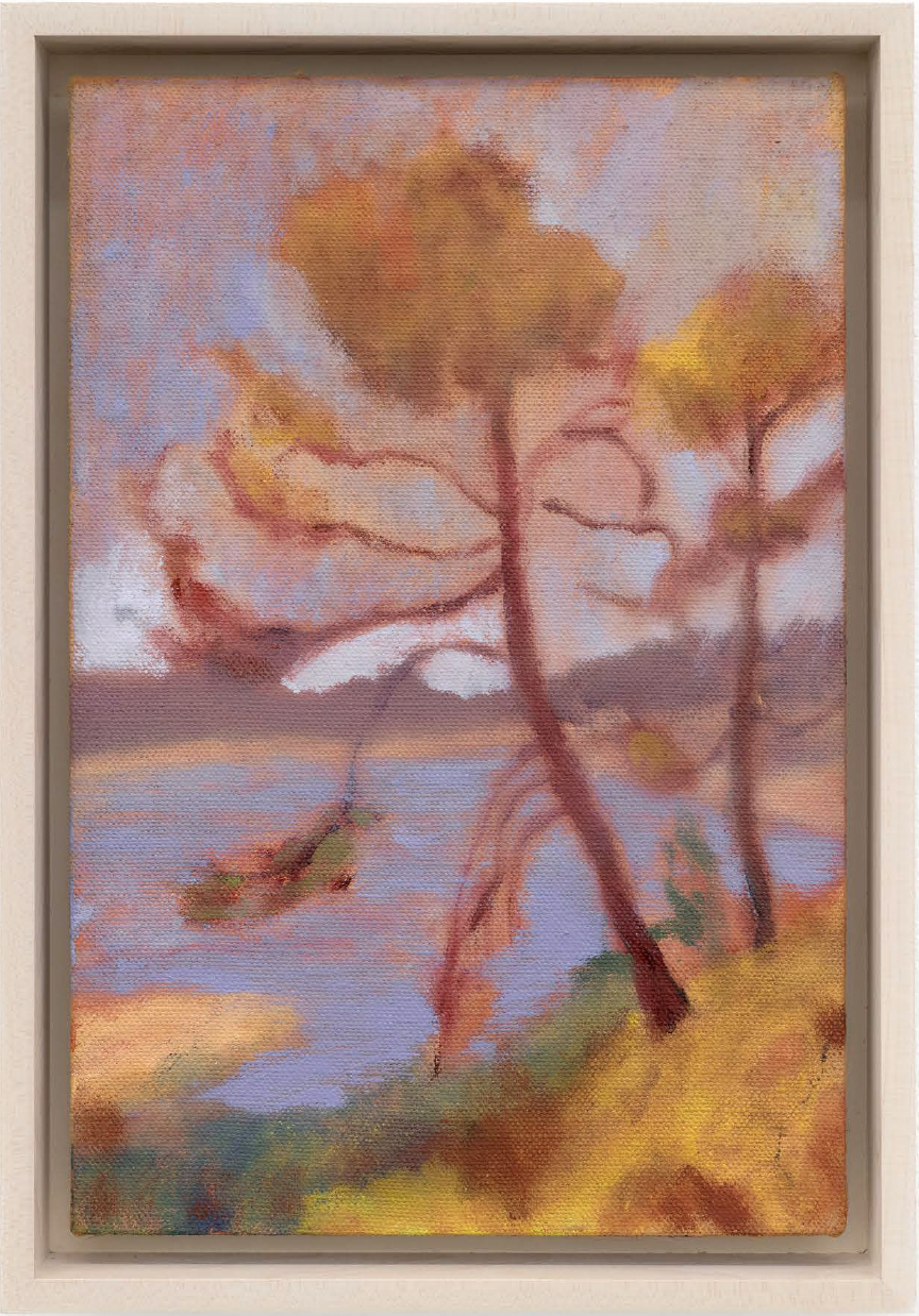 Waiving to the Water, 2025. Oil on linen, mounted on wooden panel. Canvas: 11 3/4 x 7 3/4 x 1/4 in. (30 x 20 x 0.7 cm.) Framed: 13 1/4 x 6 1/4 x 1 1/5 in. (33.7 x 15.9 x 3.8 cm.) Courtesy of Scroll NYC.

Phillip Edward Spradley
Phillip Edward Spradley is a cultural producer based in New York City.
view all articles from this author


