
Whitehot Magazine
July 2026
"The Best Art In The World"
"The Best Art In The World"
July 2026
Top 4 Artists to Know in This Massive Group Show

By SERENA HANZHI WANG December 22rd, 2025
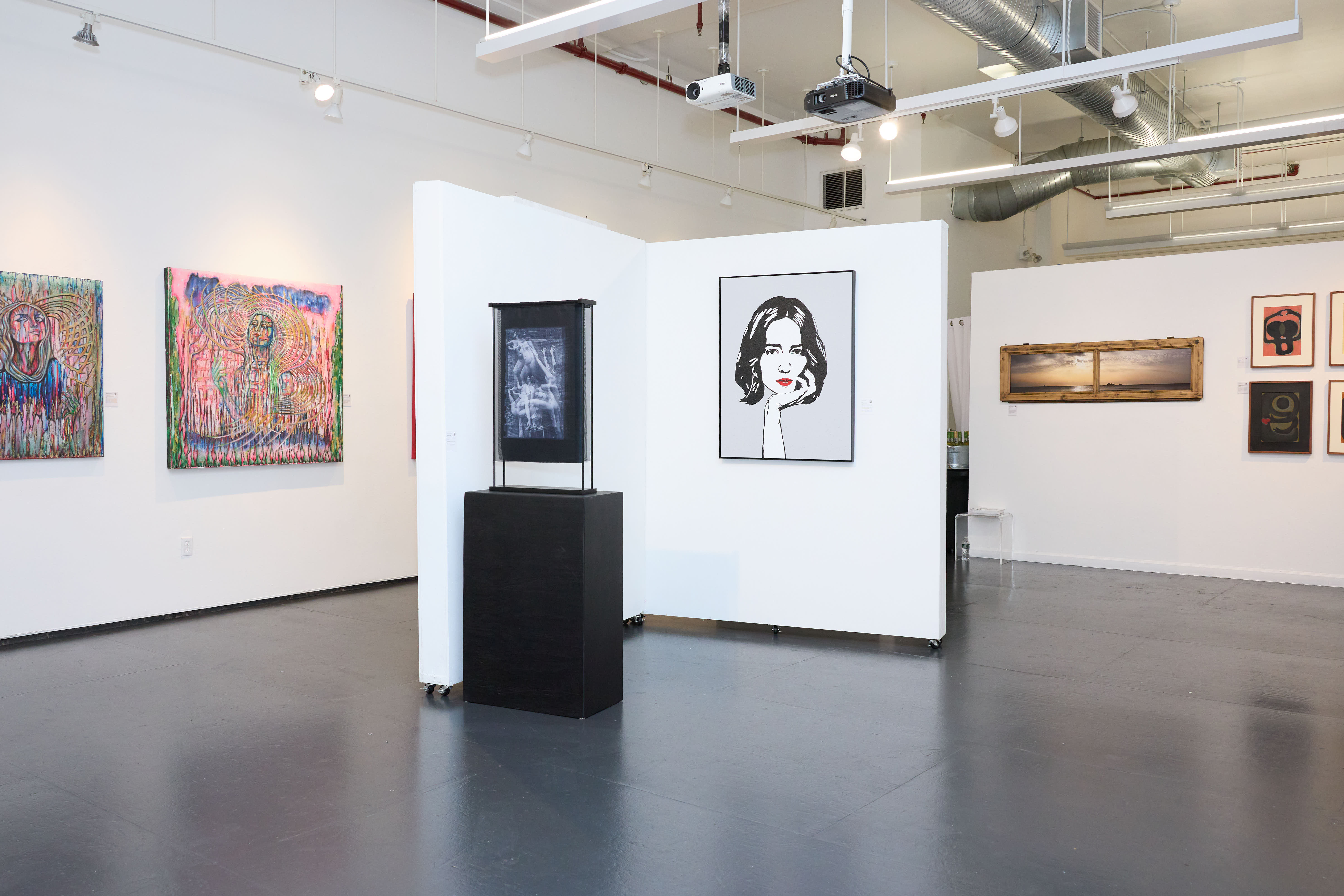
In a group exhibition of this scale, with nearly forty artists showing, it becomes less useful to search for a single unifying theme. Instead, the exhibition Interconnecting Line at NYC Artio Gallery invites viewers to trace distinct voices as points of orientation. Certain works begin to function like anchors. They are not louder than the rest, but more precise in how they hold material, memory, and form. Within this expansive field, four practices stand out for the clarity of their internal logic and the specificity of their visual language. Together, they offer an entry point into the exhibition, not as a definitive ranking, but as a set of coordinates.
Jim Black lets time show in his paintings. Layers stay visible, and nothing feels rushed or polished.
River Liu turns memory into something visual using design tools like symbols and layout.
Mark Jarzombek plays with materials while paying close attention to form and balance.
Van Dyke tweaks portrait structure just enough to make faces feel off, but still human.

Jim Black’s paintings appear quiet at first. The longer you spend with them, the more they begin to feel like places rather than images. His surfaces are thick with wax and oil, repeatedly scraped back and reworked. They read less like finished statements and more like memory trying to settle into form. In works such as Bent and 68 Not 54, nothing feels overly polished or final. Every area looks pushed, reconsidered, and adjusted until it lands somewhere honest.
There are traces of structure in his grids and blocks of color, but they never lock into something rigid. Instead, they hover between order and collapse. The effect is similar to passing an old building you see every day but never fully register. The weight of the materials gives the surface gravity, but the compositions remain open and vulnerable. Black’s work does not try to impress or perform. It simply holds space for uncertainty and conviction at the same time.
You can sense his hand at work. He scratches away, adds something back, then pauses. The goal is not perfection, but persistence. These paintings reward patience. They feel lived in rather than staged, and that sense of time gives them a quiet strength.
River Liu’s work takes a different approach. Instead of building through material density, she focuses on clarity. Her piece is structured around a simple but deliberate idea. She uses tools from graphic design, such as layout, symbols, repetition, and mark-making, to think through personal memory.
In Mother, the flowers almost overwhelm the image. This excess feels intentional. The flowers act less as decoration and more as a mood she is trying to sustain. The figure at the center is not realistic. It functions more like a symbol, standing in for someone she is thinking about rather than portraying directly.
What gives the work tension is the mix of softness and structure. Illustration sits alongside coordinates, numbers, and directional marks. These elements interrupt the image and pull it toward something more organized. It feels as though Liu is mapping an emotional location rather than a physical one. Her design background shows in how she balances dense areas with open space, and in how she lets symbols and images coexist without forcing them together.
Liu’s work sits between design and personal storytelling. She uses clarity to contain something less controllable, such as memory, feeling, and the way images stay with us over time. The tone remains steady and thoughtful, and clearly her own.
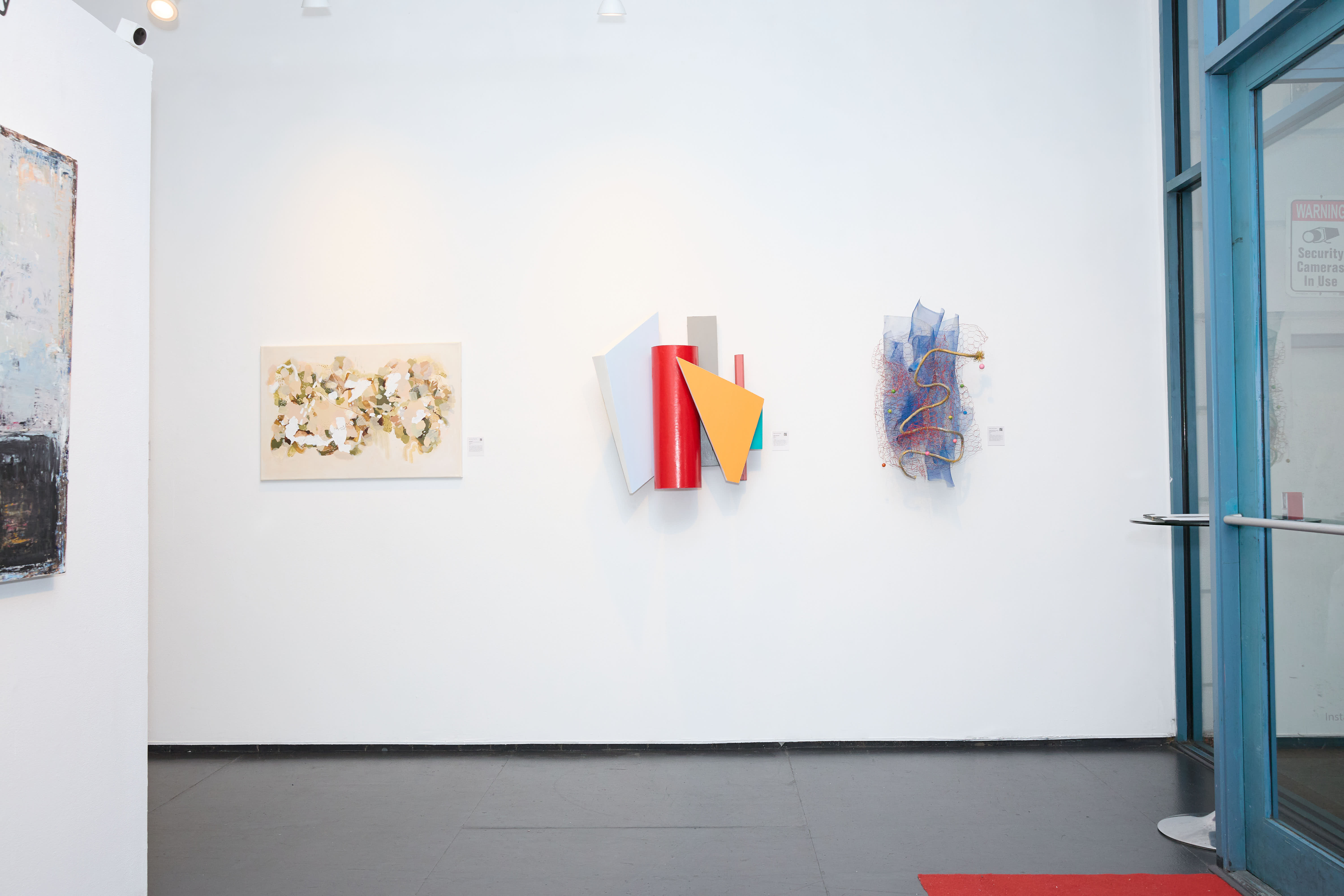 Mark Jarzombek’s work introduces a sense of lightness into the room. Tuesday Morning Love Song looks almost accidental at first. Wire mesh twists loosely, a rope hangs casually, and beads appear as if they wandered in from a craft table. With time, the arrangement reveals itself as intentional. The materials bend, sag, and tangle in ways that feel natural but are carefully considered. There is humor in the work, but also respect for the awkwardness of the materials.
His other piece, Shifting Signifiers, feels sharper and more controlled. Angled planes and bright colors bring in a sculptural language that feels architectural without becoming cold. The forms extend outward rather than staying flat against the wall. They interact with the surrounding space, and their shadows become part of the composition. This softens the geometry and makes the work feel more physical.
What connects Jarzombek’s pieces is his interest in how objects behave. He moves easily between looseness and structure. One piece leans into messiness, the other into precision. Both ask similar questions about weight, balance, and response. His work does not require heavy explanation. It simply asks you to look longer than expected.

In Amelia and Carmen, Van Dyke subtly shifts the structure of the face. The cheekbones sit slightly out of place, and that small adjustment changes everything. The faces feel unsettled, not broken, but rethought. Curves flatten into planes, shadows become geometry, and the softness typical of portraiture gives way to something more deliberate.
The expressions remain calm. There is no dramatic emotion being pushed onto the figures. Instead, Van Dyke creates tension through restraint. Muted colors keep the paintings quiet, while sharp angles keep the viewer alert. Your eye moves across the surface even though the subject does not move at all.
These portraits are less about personality and more about perception. They focus on how a face can be taken apart and rebuilt while still feeling human. Van Dyke’s control is what makes the work compelling. Nothing is overstated. He gives just enough information to follow the structure, and that quiet precision stays with you.
Why gather forty artists in one room? Beyond practicality, the gesture reflects how contemporary art is increasingly experienced: through proximity rather than hierarchy. No single work carries the exhibition. Meaning emerges in the gaps.
Here, Jim Black’s dense surfaces, River Liu’s graphic memory work, Mark Jarzombek’s material experiments, and Van Dyke’s quiet portraits sit side by side without resolving into a single story. What remains is not a conclusion, but a lingering sense of attention. The exhibition ends physically at the door, but its images tend to resurface later, unprompted, which is often the clearest sign that something has registered.

Serena Hanzhi Wang
Serena Hanzhi Wang (b. 2000) is an award-winning art proposal writer, multimedia artist, and curator based in New York City. Her work spans essays, exhibitions, and installation Art—often orbiting themes of desire and technological subjectivity. She studied at the School of Visual Arts’ Visual & Critical Studies Department under the mentorship of philosophers and art historians. Her work has appeared in Whitehot Magazine, Cultbytes, SICKY Mag, Aint–Bad, Artron, Art.China, Millennium Film Workshop, Accent Sisters, MAFF.tv, and others.
view all articles from this author


