Whitehot Magazine
October 2026
"The Best Art In The World"
"The Best Art In The World"
October 2026
In Conversation: Derriann Pharr and Her Pursuit of Transcendence
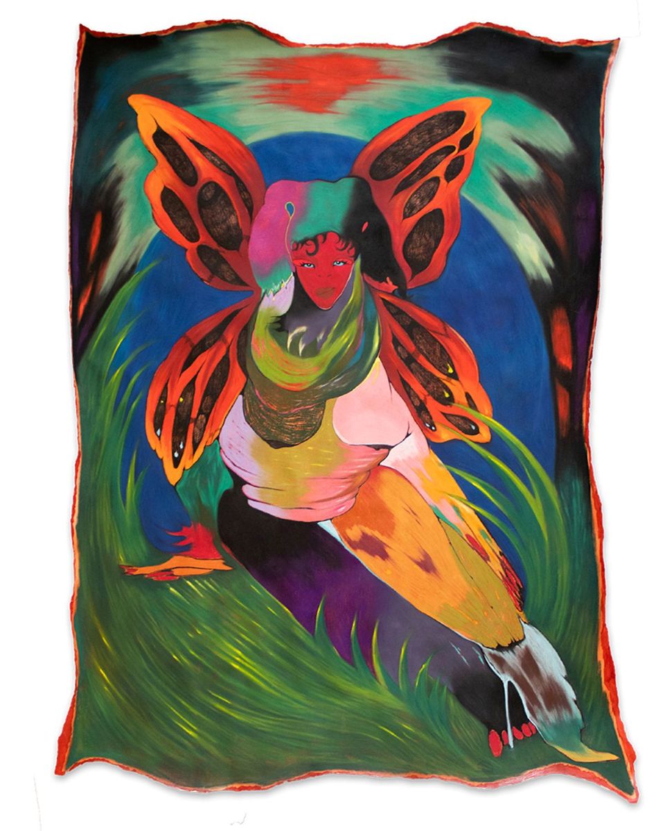 Derriann Pharr, I Am a Bloodstone, 2024 mixed media on paper 62x42 inches. Photo courtesy Luis DeJesus Los Angeles
By JAKOB DWIGHT September 10th, 2026
I came across Derriann Pharr’s work through her solo show at Bells Gallery in Dothan, Alabama. From her current residency at Studio Museum in Harlem in New York Pharr and I had a conversation about her work, the processes, ideas and emotions behind them.
JD: Can you say a bit about how you go about getting those vivid colors that viewers often think is oil paint, a bit about how you use your chosen mediums - watercolors, colored pencil, etc? Is there an order of operations for instance, an underpainting or drawing?
DP: I’m thinking about guiding color in an anatomical way. Color and texture weave and collide like the internal systems of our bodies—like bloodflow, breath, and homeostatic calm within the nerves. It makes sense, to me, to build a figure with its most cellular components in mind. I layer a variety of media—acrylic fluid, pastel, color pencil, and gouache—in unlike ways to reveal tension and harmony between the materials at once. There is an acknowledgement of time passing and occurring within the layers. I tend to associate grittier, muddier spurts of color with unresolved parts of self—past lives, shadows, and scarred histories. Smooth, seamless glides of color feel autonomous and resolved. The colors reflect my fixations on iridescence and translucence found in both manmade and natural scenarios. The shine on the chrome of my daddy’s Chevy Caprice and in my mother’s earrings, is the same glimmer of light that reflects off the ripples of water in the Buttahatchee River back home in Alabama. I am struck by these visual rhymes.
I enjoy writings by poet and historian Kamau Brathwaite, whose frameworks of fluid returns of oceanic tides remind me to guide color beyond linear expectations. Thinking back to the cyclical flow of the body, whose pulse is in and out, around and around, I begin a work by mapping the figure’s composition on paper with graphite or charcoal. A toothy gesso is applied afterward and between layers of media to ensure it holds properly. Sometimes these steps are omitted, overlapped, or adapted depending on the particular mark or texture I aim to make.
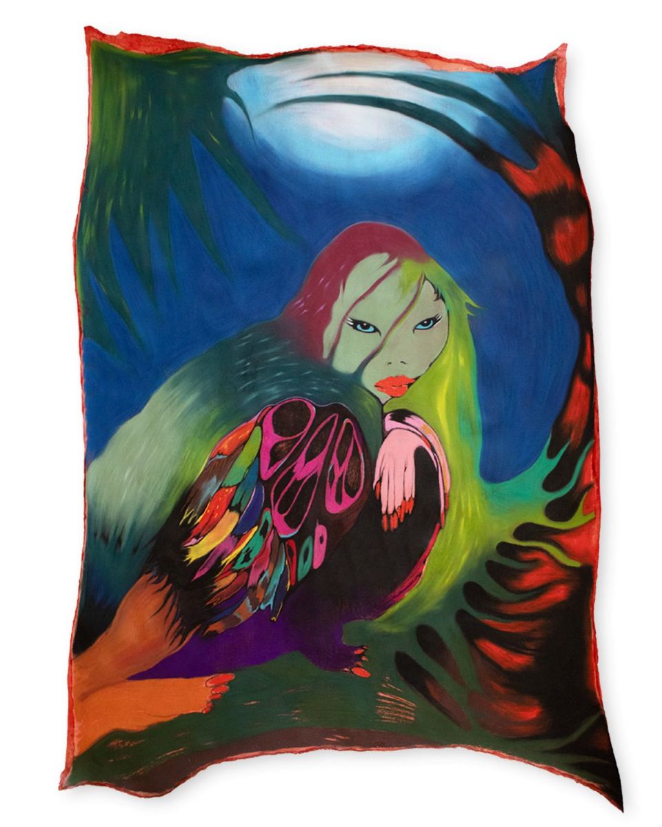 Derriann Pharr. A Bird's Blood, 2024, mixed media on paper. 44x30 inches. Photo courtesy Luis DeJesus Los Angeles
JD: When you were talking about using photographic collage, folding photos of realworld things into your phantasmagoric reality I thought about the conversations I recently had with intermedial art pioneer Claudia Hart about our visions for what art experience could or should be. Could we possibly say that part of the aim of the art experience is always to reconcile both the artists and the viewer with this world in some way, with their own lives through poetic reflection and potential insight?
DP: For me this is true. Drawing, painting, and photography are the pillars of my practice. I find a lot of inspiration in dissecting imagery of my own body and observing its relationship to the world my figures exist in. The photos are my offering to the work—a deep reverence for human experience that I am nestling into the scenes I paint. How does this exchange create a shared space of safety? How am I inviting a viewer into this realm of freedom through material? How does this realm evoke a sense of agency in the viewer that is usable in our world? The photo work is that bridge.
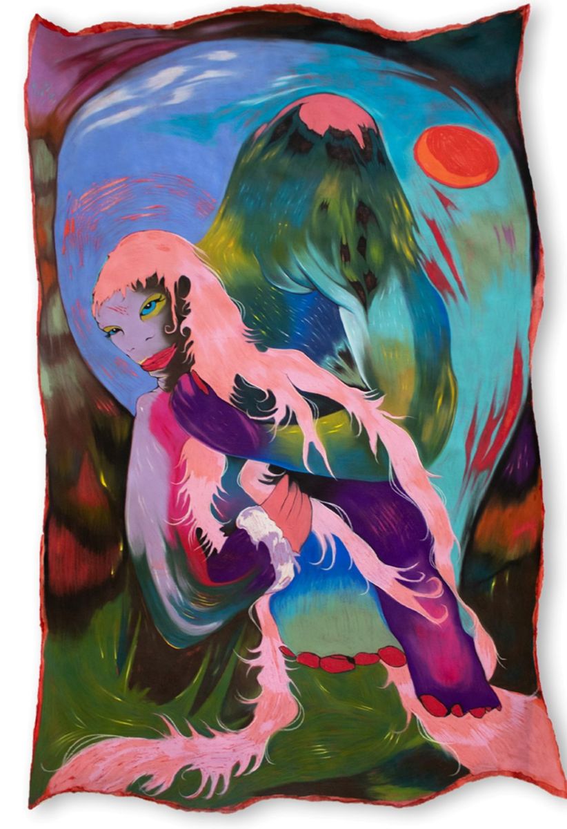 Derriann Pharr, Can't Cut My Baggage Loose, 2025, mixed media on paper, 66 x 41 inches. Photo courtesy Luis DeJesus Los Angeles
My paintings are equally inspirational to my photo work, too. At the root of my practice is a pursuit of transcendence—a conquest to disrupt historicized boundaries of the figure and reclaim bodily autonomy on my own terms. Beyond that, it’s a sacred space I am cultivating to protect my internal sensitivities. Tending to the figures have provided a soothing balm for my own wounds.
JD: Can you say a bit about the idea that an artwork can be "too aesthetic," "too pretty"?
DP: I think my work exists at the ecotone of this perspective by intention. On one hand, I feel quite disconnected with art I cannot see or acknowledge the fullness of humanity in. The arts, as we know them, are rapidly changing as the emergence of AI generated imagery infiltrates design and art spaces. This complicates the way we “see” and engage with a work. AI art “galleries” whose intentions might be to activate the viewer’s sensory experience at max volume actually make me tired—like pushing ultramarine and cadmium yellow too far. Overt immersiveness supersedes the human hand and conceptual depth I am personally drawn to.
That said, the assumed superficiality of work that appears “too aesthetic” still catalyzes a viewing experience, whether it be positive or negative. The dichotomy born from viewing contemporary media with a dated framework of “seeing” is fascinating to me. It reveals so much about how a viewer might enter an artwork, and what tools they carry into it to understand. There is a particular chromophobia—rooted in classicism, racism, and sexism—that rejects the sensory and emotional experiences induced by vibrant, dense color palettes altogether. There is an even broader rejection of the feminine jewel tones I paint with. To locate the line where an artwork becomes “too pretty” is tricky, but I approach that boundary in my practice as a space of playful liminality and protective subversion.
 Derriann Pharr. Prowler, 2024, mixed media on paper. 46x79 inches. Photo courtesy Luis DeJesus Los Angeles
I knew early on it would be important to shield the figures in my work from a lazy gaze. In the same way a peacock fans its iridescent tail train to both attract its mate and repel its predator, I am using a dated construct against itself to protect the purity of my figures. Entrance to the work is only given when the viewer has held a mirror to themselves, and challenged the vantage point they aim to enter the work with. If you are previously convinced that an artwork’s density reflects its irrationality or naivety, then of course you’ll only see an object and its bright colors. To hide the gravity of the figures’ souls amidst the saccharine, is to hide in plain sight. The palette is permission.
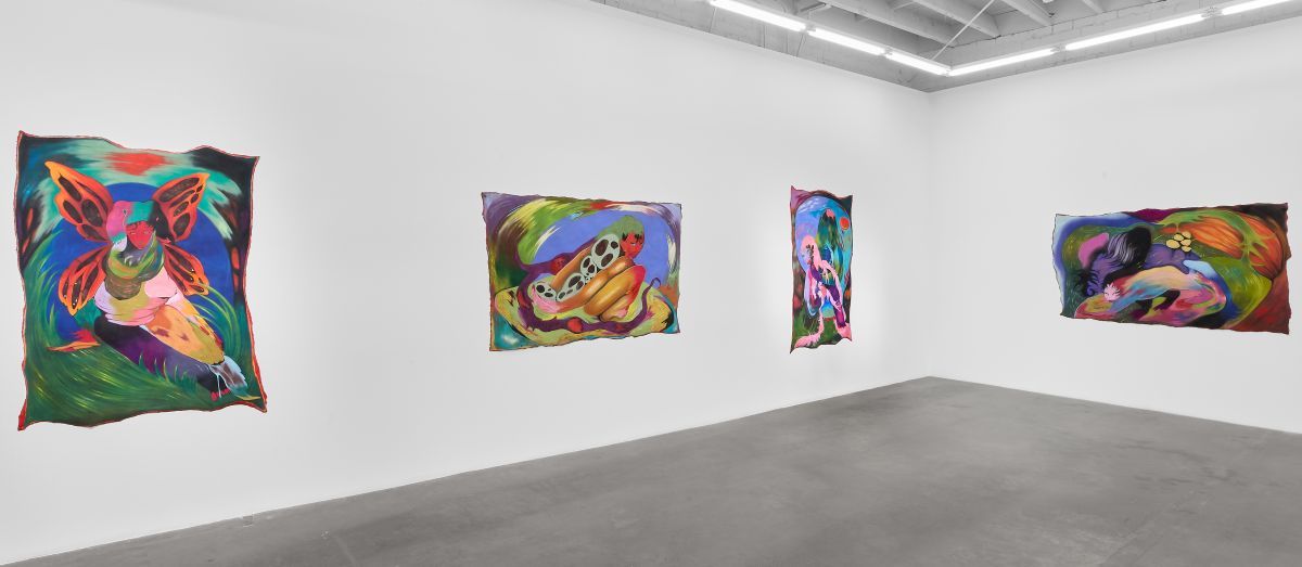
Installation view of Derriann Pharr’s solo exhibition I am A Bloodstone at Luis DeJesus Gallery, Los Angeles 2025. Photo courtesy Luis DeJesus Los Angeles

Jakob Dwight
view all articles from this author