
Whitehot Magazine
July 2026
"The Best Art In The World"
"The Best Art In The World"
July 2026
Great Abstract and Abstract-Adjacent Exhibitions Around New York
By LIAM OTERO June 12th, 2026
Anthony Torrano: Concrete Spirit at White Columns, Meatpacking District (March 13 - April 25, 2026)
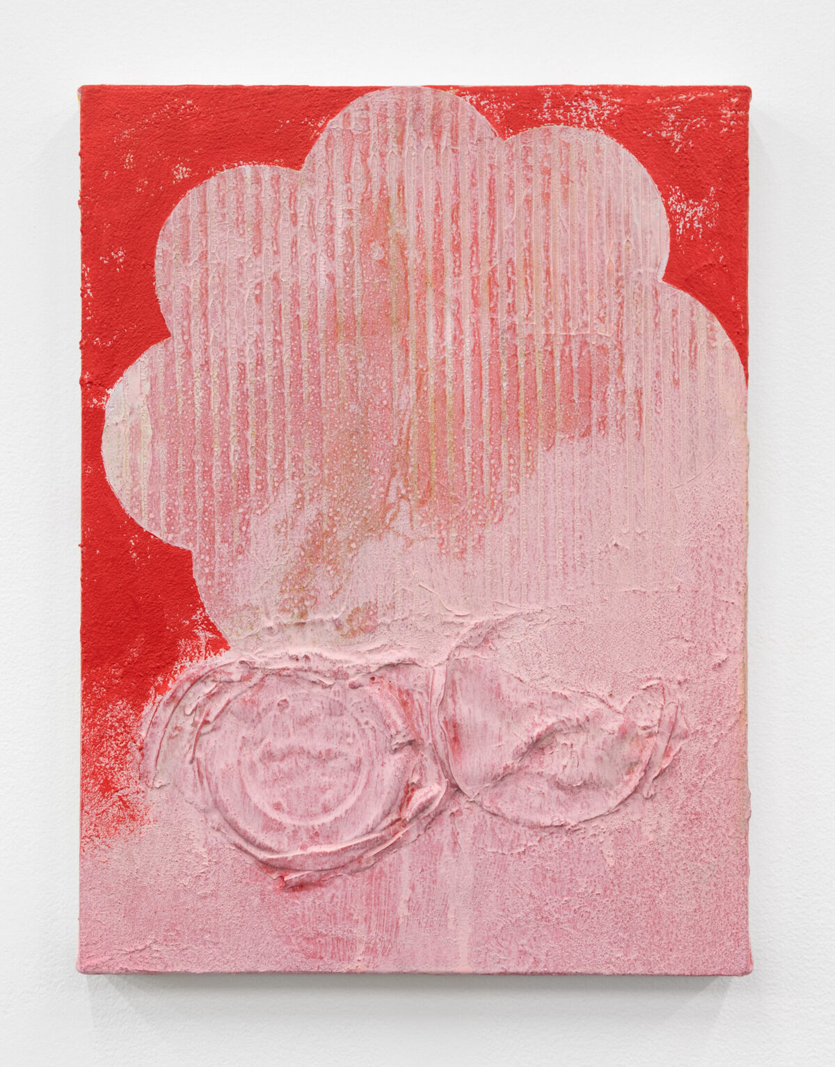 Anthony Torrano, Bakery Pink, 2026, acrylic on canvas. 16 x 12 1/8 inches. Image courtesy of the gallery.
Subject and style are part of the package for printmaking, but one must never forget that surface impressions and the force (or lack thereof) for mark-making are just as important visual attributes that provide further layers of meaning. Anthony Torrano’s first solo exhibition with White Columns worked with printmaking and painting to abstract imagery of places and iconography synonymous with his home city of San Francisco on the threshold of recognition and unrecognizability, where the image enticingly presents like scavenged documents with traces of surviving information left up to the viewers to decipher meaning.
The themes behind his show are resonant with that of the gallery’s late founder, Gordon Matta-Clark, a multidisciplinary artist whose practice often revolved around site-specific and other architectural interventions. Like Matta-Clark, the combined fragility and durability (or perhaps malleability) of memory in relation to an urban space is thoroughly investigated in Torrano’s practice, but seen in this context from the perspective of his family’s Chinese roots in the city, from family ephemera to geo-mapped information synonymous with the historic Chinatown neighborhood.
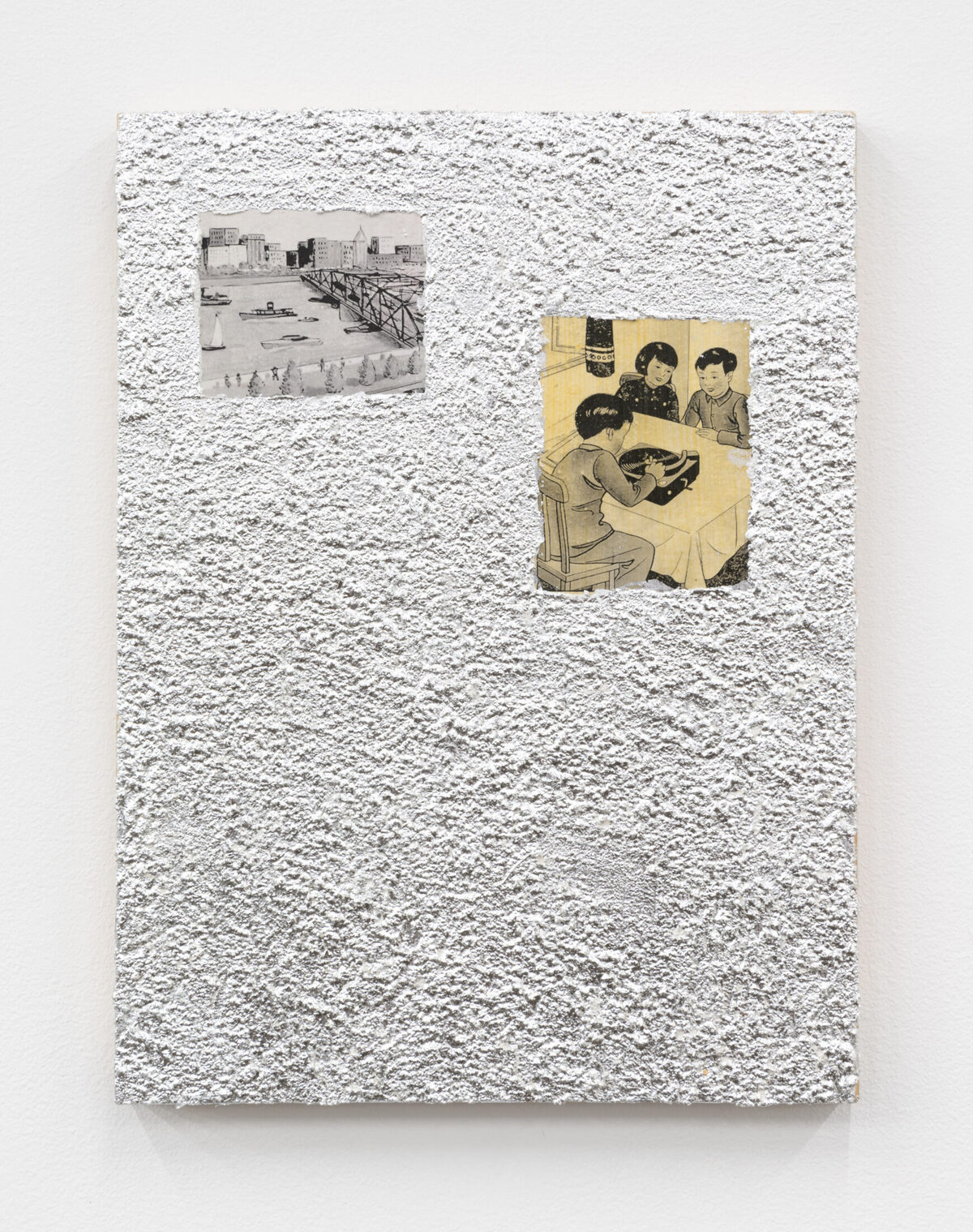 Anthony Torrano, Translator, 2026, acrylic on canvas. 16 x 12 1/8 inches. Image courtesy of the gallery.
A solid portion of the actual creative process did not occur in the studio, but literally on the streets of San Francisco. 19th Century grates, vintage coinage, and a commemorative map of the city are among several image sources whose relief details were transferred over by Torrano onto his canvases. Frottage and mold impressions are a few of the print techniques he employed to transfer images like street names or mooncakes. Varying pressure points can be ascertained based on the heaviness of applied marks that are offset by sections gradually fading out. As a recurring stylistic method throughout this body of work, Torrano’s interests in the materiality of printmaking along with the dual clarity / erasure of imagery manifests into an alluring contemplation on memory and place as elastic rather than fixity.
Elise Ansel: Duetti at Miles McEnery, Chelsea (April 2 - May 9, 2026)
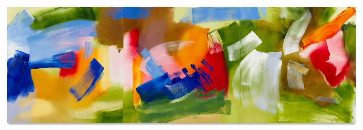 Elise Ansel, Green Going, 2025, oil on linen. 60 x 180 inches / 152.4 x 457.2 cm. Image courtesy of the gallery.
The paintings of Elise Ansel are to coloristic abstraction what Marjorie Strider’s was to figurative Pop: daring, emboldened, and in-your-face. Her second solo exhibition with Miles McEnery, Duetti, blew the seams of abstraction to magnified proportions as realized through Ansel’s masterful understanding of color theory, brushwork, and Art History.
The enormity of Ansel’s painterly presence is not revealed through the scale of compositions, but in the widened swaths of color gracing her paintings. Heavily applied strokes in rectangular formations leave the mark of hitting the linen surface and running - so to speak - before gradually petering out in thinned remnants, before being repeated in other directions and hues. These are remarkable results of an artist who knows how to wrestle with the ideas of paint as movement.
 Elise Ansel, Peach II, 2025, oil on linen. 60 x 54 inches / 152.4 x 137.2 cm. Image courtesy of the gallery.
Great as they are on formal grounds, Ansel’s images are tonal and compositional homages to Titian, one of the most celebrated painters of the Italian Renaissance who, like Ansel, possessed a remarkable command over color. Getting past the additive abstraction, Ansel’s paintings steadily reveal the general arrangement of Titian’s paintings, but with figures and scenic elements reduced to or replaced by rectangular swooshes and crossings of paints in some of the most magnificent hues loosely recalling the Venetian forebear’s attractive style. Ansel is neither copying nor being on the nose about this association, but demonstrating how a contemporary painter - someone who is steeped in the now - can still so beautifully keep a foot (or brush) extended into the distant past and make it her own artistic statement.
Elizabeth Abel: Acquiescence at Hollis Taggart Downtown (April 10 - May 10, 2026)
 Elizabeth Abel (British, b. 2001), Blush, 2025, acrylic on canvas. 47 1/4 x 55 1/8 inches / 120 x 140 cm. Image courtesy of the gallery.
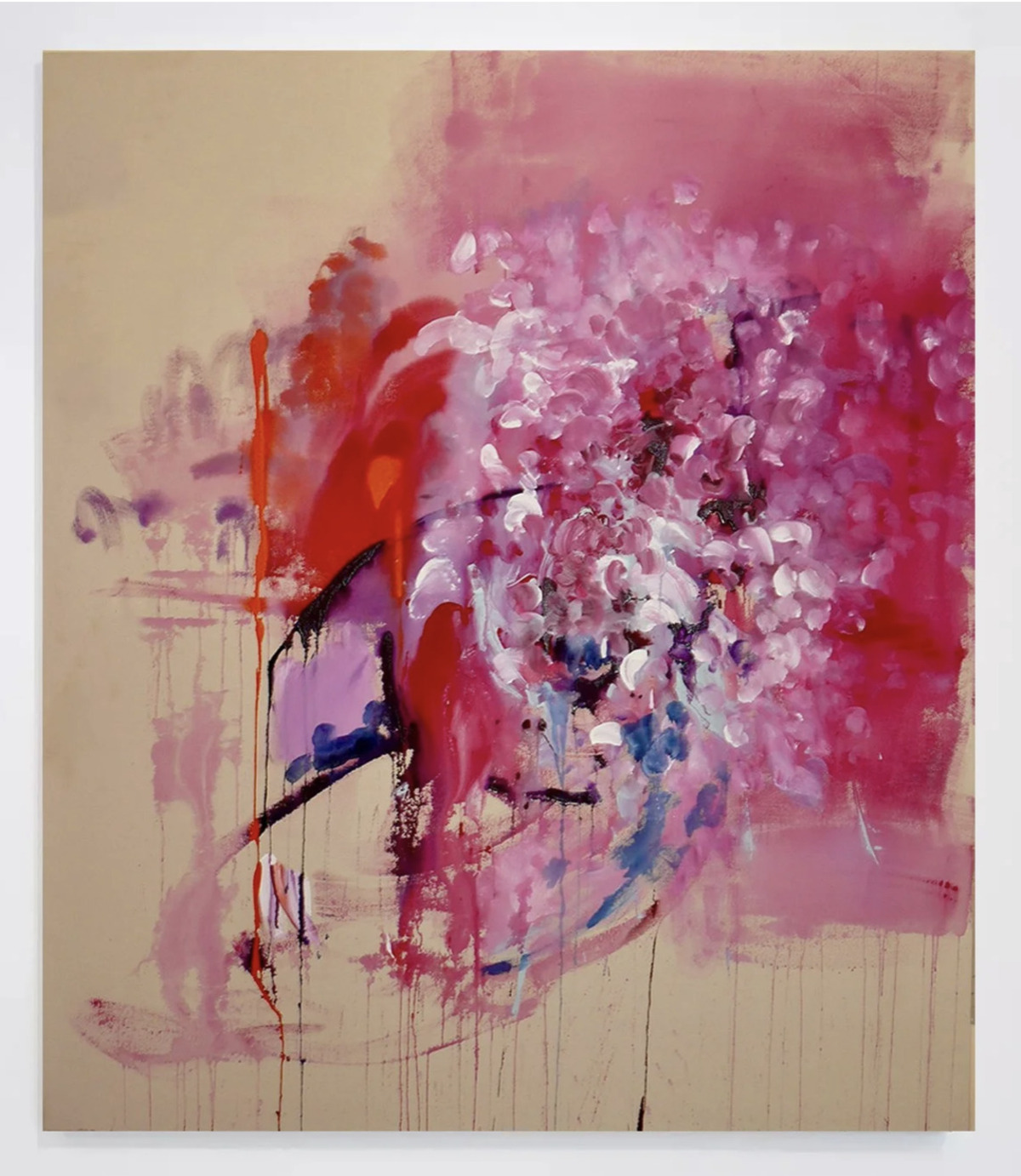
Elizabeth Abel (British, b. 2001) has emerged onto the New York art scene from across the pond in her native England with a spirited body of new paintings celebratory of invigorated gestures and florid coloration. These overflowing bouquets of acrylic vitality are charged with a potent energy that carry much expression and thrust while considerate of the equal importance owed to open space.
Abel works with a rapidity of hand as she wants her painted marks to seize something of the moment, very much in the spirit of the Impressionists and their penchant for capturing the transience of life (and just like them, she paints straight from the tube). Room is given to improvisatory marks and free-form execution, but Abel’s process is just as demonstrative of a certain controlled chaos that permeates. A high level of detail is achieved through the build-up of paints onto canvas, but one can readily imagine a scene where Abel makes a few alterations and finishing touches before reaching finito - not a mark more or less, but an overall satisfaction and sense of wholeness of what lays before her vision.
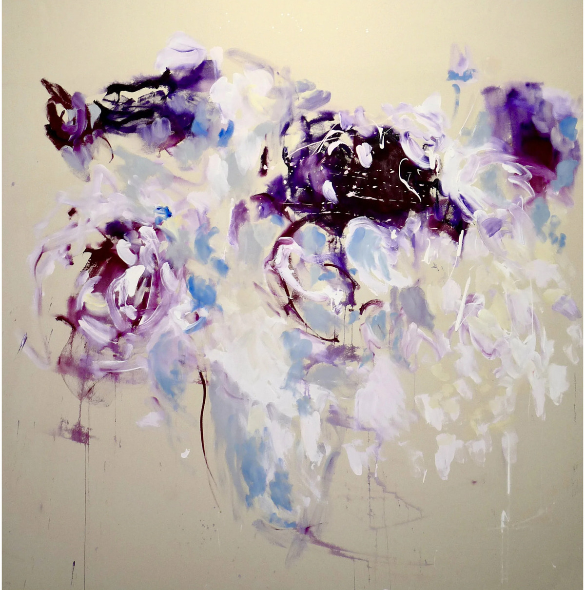 Elizabeth Abel (British, b. 2001), Lilac Ground, 2026, acrylic on canvas. 70 7/8 x 70 7/8 inches / 180 x 180 cm. Image courtesy of the gallery.
Armed with the painterly wisdom of English Romanticist J.M.W. Turner and Austrian artist Martha Jungwirth, Abel forged her own path in an animated interplay of transparent smearings, cloudy blends, and daubed fields. Yet, the use of negative space cannot be neglected when studying these wondrous paintings as their contributions to each composition are what keep the eye focused on the symphonic arrangement of colors. Something would have been amiss if these canvases were entirely covered inch-to-inch, edge-to-edge as visual focus would have been lost. To play off of a certain film title and equally similar painting series by Barnett Newman: “Who’s afraid of negative space?”. Certainly not Elizabeth Abel. At just 25 years old, she has developed a painterly language and style that can confidently be described as solely her own, such that many painters do not achieve until much later in life. The future is bright, just as it is in Abel’s work!
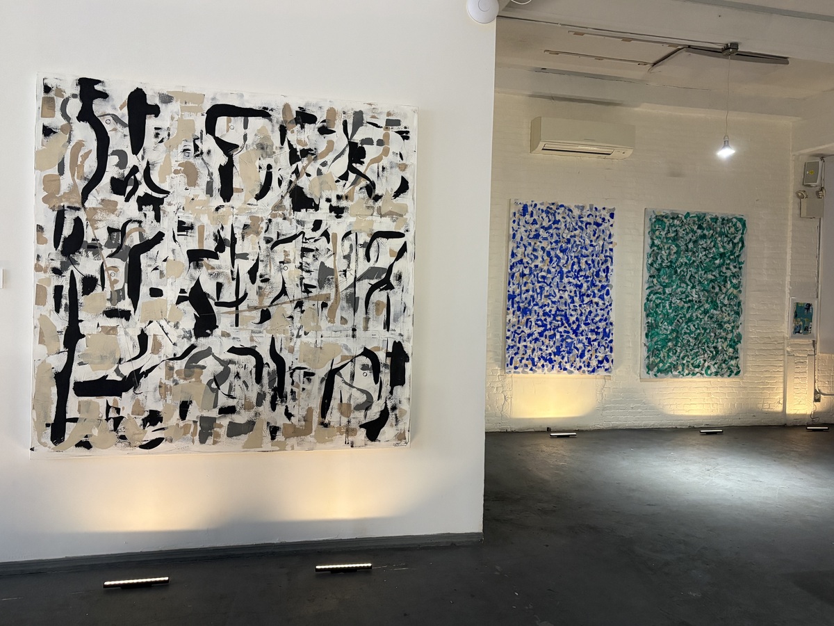
Waves of Knowing at Ryan Lee Gallery, Chelsea (April 9 - May 9, 2026)
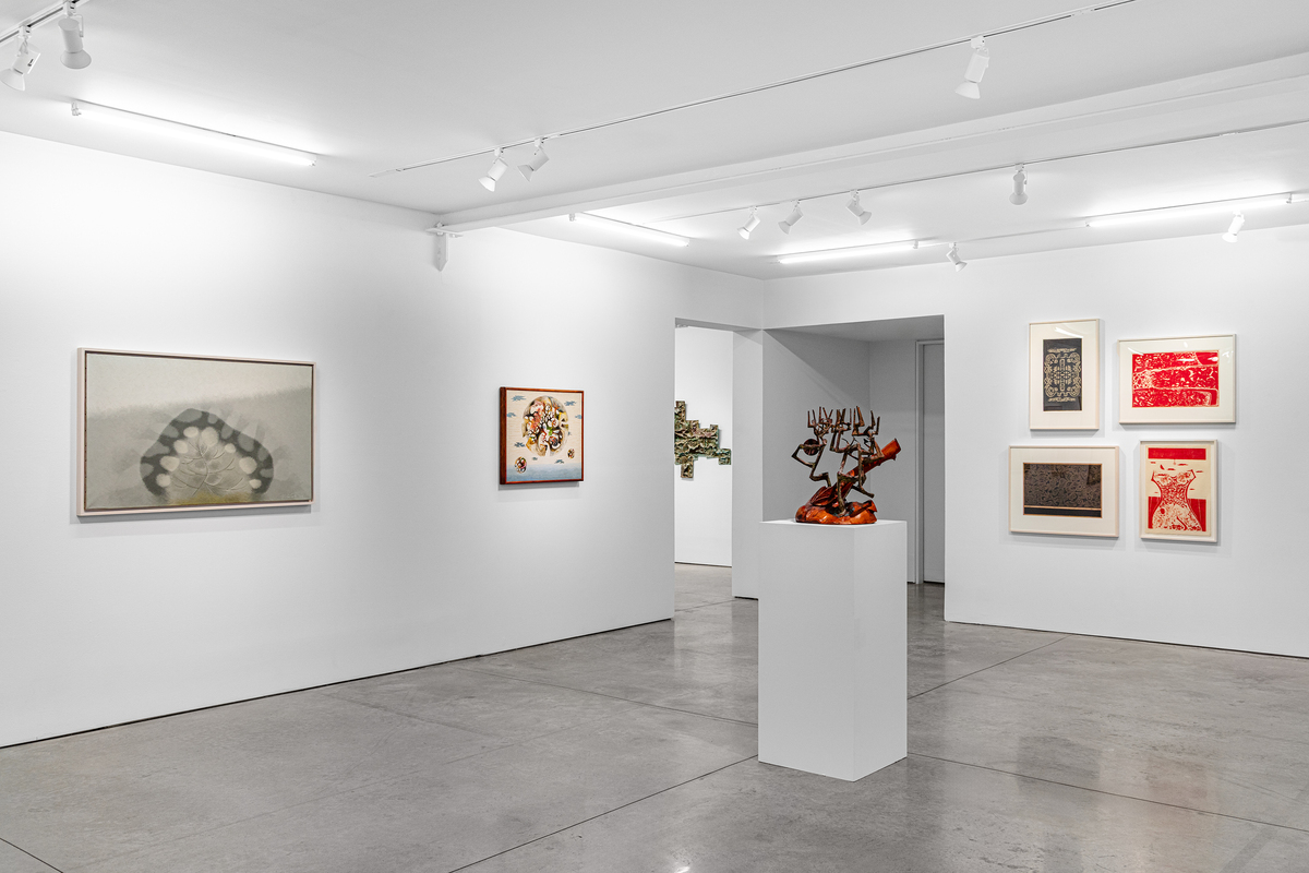 Waves of Knowing installed at RYAN LEE Gallery, New York, 2026.
New York is one of the great art capitals of the world, but it is as much an embodiment of - what I call - a “gateway city”: a major arts center that is not only rich in its local cultural output, but also in its ability to tap into the undercurrents, trends, and ideas found in other parts of the world. Waves of Knowing at Ryan Lee Gallery revisited the seldom acknowledged history of Metcalf Chateau, a coterie of Japanese-American artists from Hawaii whose own forms of abstraction were a personal melting pot of family histories, Asian diasporic culture, and individualized experiences abroad. A herculean effort of in-house research from the gallery together with the presentation of a sumptuous medley of works by the collective’s five artists culminated in an academically rigorous curatorial experience.
 Harry Tsuchidana, Untitled, 1982, oil on linen. 21 x 26 1/2 inches (53.3 x 67.3 cm). Image courtesy of the gallery.
A brief breakdown of the arresting qualities specific to each of the five artists: Satoru Abe’s evident mastery of hand-cut copper to produce stylized sculptural landscapes that border on two- and three-dimensionality; Bumpei Akaji’s laboriously worked copper panels whose patinated surfaces provoke a somber and cathartic mood; Tetsuo Ochikubo’s gestural abstract paintings and lithographs whose infusion of calligraphic-like strokes recalls the experimentalism of Gutai meets American action painting; Tadashi Sato’s compositionally sedate and spiritually translucent paintings of orb-like forms in spartan zones; and Harry Tsuchidana’s color-driven paintings where impactful shapes and shades are the ultimate building blocks to their formal attractiveness.
Based on the rich selection of works exhibited, the members of Metcalf Chateau were a phenomenal fusion of some of the best of the mid-20th Century’s Art Worlds: New York Abstract Expressionism, post-war European Modernism, traditional Japanese practices, and an emergent Modernism specific to Hawaii’s tropical climate.
Clifford Bertin: Traveling Griot - A Homecoming at Sanders Studio, Clinton Hill / Fort Greene, Brooklyn (April 16 - May 16, 2025)
 Installation view of Clifford Bertin: Traveling Griot - A Homecoming at Sanders Studio, Clinton Hill / Fort Greene, Brooklyn.
Who could have imagined that a darkened space would enhance the experience of intimately engaging with painting? Curator Shauna Hayes certainly found the potential in such a way with her solo exhibition on Haitian-American artist Clifford Bertin. This exhibition was not in a conventional gallery, but in the spacious front room of Sanders Studio, a multi-purpose production facility with ample floor space and exposed brick walls in the Clinton Hill / Fort Greene neighborhoods of Brooklyn.
Switching back and forth between gigantic paintings and more intimately-scaled works, Bertin’s abstraction is a visual mediation of his ancestral Haitian roots. Watery blues and greens are recurring colors in the vibratory images that are marked with emboldened lines and repeating motifs loosely resembling eyes, as if alluding to the watchful eyes of ancestor spirits.
Aside from some soft lighting, much of Sanders Studio was enshrouded in darkness. Good lighting tends to be an important factor for what makes a successful curation, but what about good darkness? The dimmed presentation had a transformative effect in which it did not feel like you were entering an exhibition space, but more so an inner chamber or zone of contemplation. Hayes’s choice of exhibiting these paintings in the absence of light managed to enhance the pulsating and meditative qualities inherent in Bertin’s work to a completely new dimension of rewarded looking.
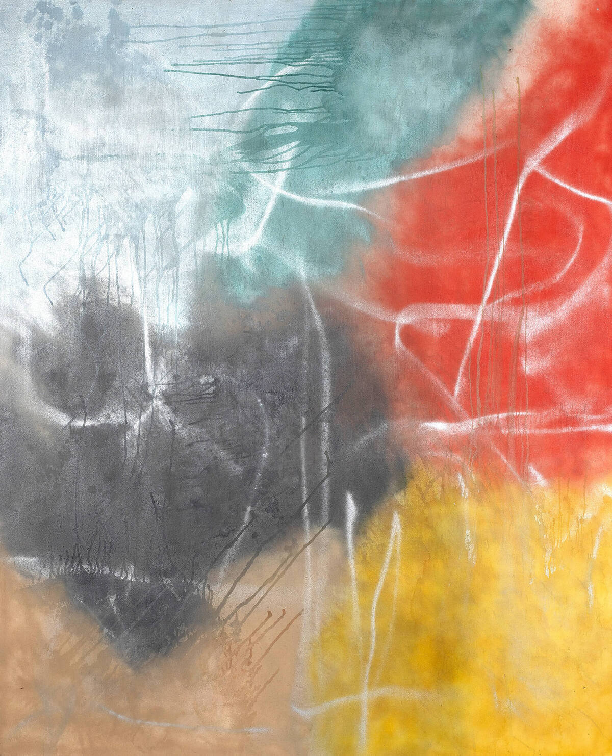
Dissolution / Resolution: Murray Hochman at AP Space, Chelsea (on view through May 30, 2026)
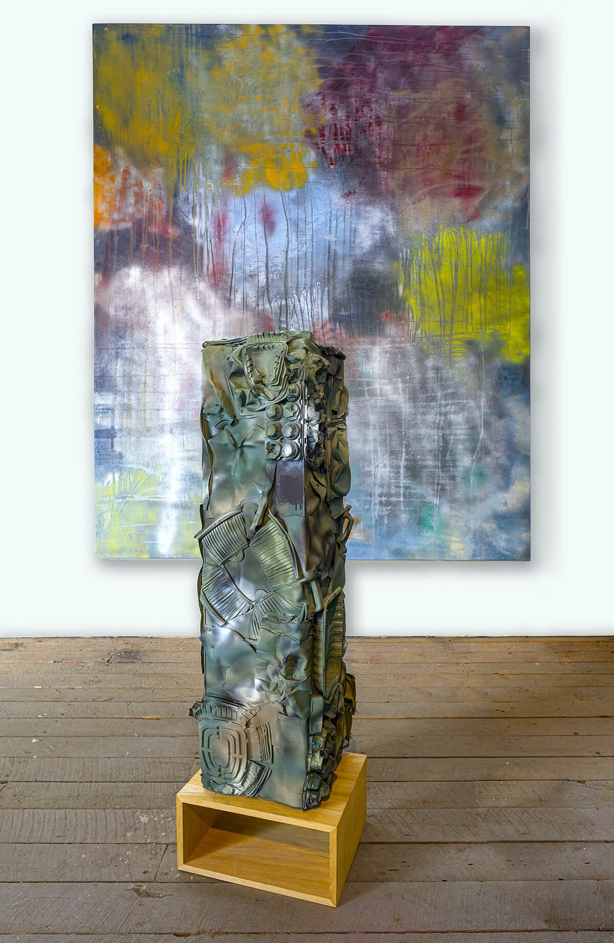 Murray Hochman, (front) Camo Tower No. 1, 2023, plywood, plastic, and aerosol paint. 50 x 12 x x 12 inches. (back) Large Polychrome No. 1, 2005, aerosol paint on canvas. 120 x 96 inches. Image courtesy of the gallery.
At 92 years old, Murray Hochman just may have put out his magnum opus. His solo exhibition, Dissolution / Resolution, at AP Space in Chelsea was a triumph in demonstrating what over sixty years of art-making can do for the serious artist. To be an artist is to recognize the importance that growth is to one’s development. Co-curated by Alan Goolman and Jean Park, this exhibition proved that Hochman’s years of experience and the creative wisdom absorbed along the way manifested into an explosively fruitful chapter in the artist’s twilight years in the areas of large-scale painting, works on paper, and sculpture.
Originally a New York-based artist, Hochman has spent the last 26 years working from the comforts of a spacious barn studio in Tyringham, a rural town in Berkshire County, Massachusetts. This asceticism enabled him the quiet respite of country living to truly unleash his imaginative vision into new conceptual terrain. The scale of Hochman’s paintings are rather grandiose, with several of the works in the show measuring at heights of 10 x 8 feet, a physical magnitude best reflected in their wall-consuming presence.
 Murray Hochman, Large Polychrome No. 5, 2002, aerosol paint on canvas. 96 x 84 inches. Image courtesy of the gallery.
An elaborate merging of stylistic influences and techniques coalesce into breathtaking results, ranging from urban graffiti scrawls to the impulsivity of 1950s action painting. A pleasing cohesiveness to Hochman’s painting, which goes back to the title of the exhibition, is how light and color are filtered within his compositions. Through the dense canopies of aerosol paint, the two formal attributes are in active dialogue as realized by shifting tonalities and luminescent veneers.
The lone sculpture in the exhibition, Camo Tower No. 1 (2023), perfectly complemented the mostly painting and work on paper focus in recognizing how Hochman’s views on paint translate into three-dimensional form. A distinguishing feature of Hochman’s sculptural practice to note is that he is inclusive of an abrasive texturality from the distressed and meshed together plastic materials sutured in the camouflaged patterning the artist enthusiastically adopted in the 2020s.
Dissolution / Resolution made for a most inspiring encapsulation of what concentrated looking and persistence bestows in an artist like Hochman whose late-career endeavors cover a flourishing landscape of creative expression.
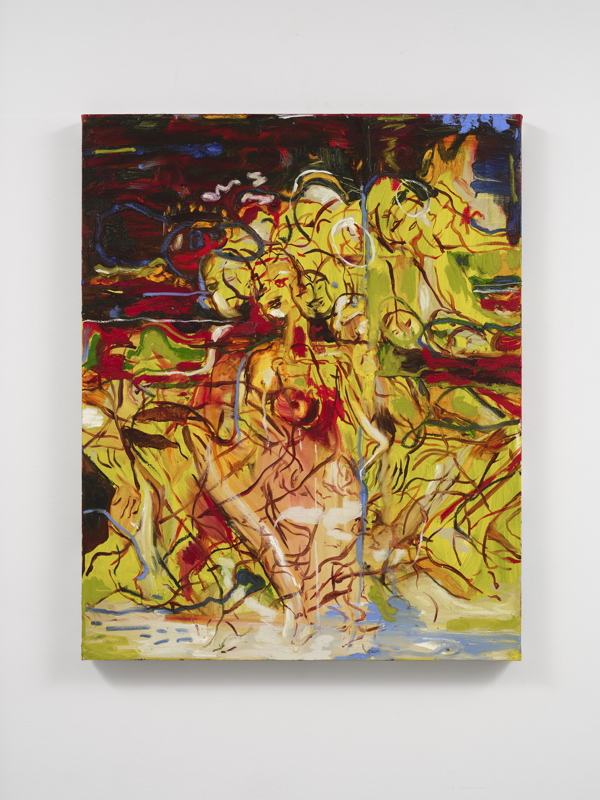
Lewinale Havette: I Love It When You Beg at Palo Gallery, East Village (on view through June 13, 2026)
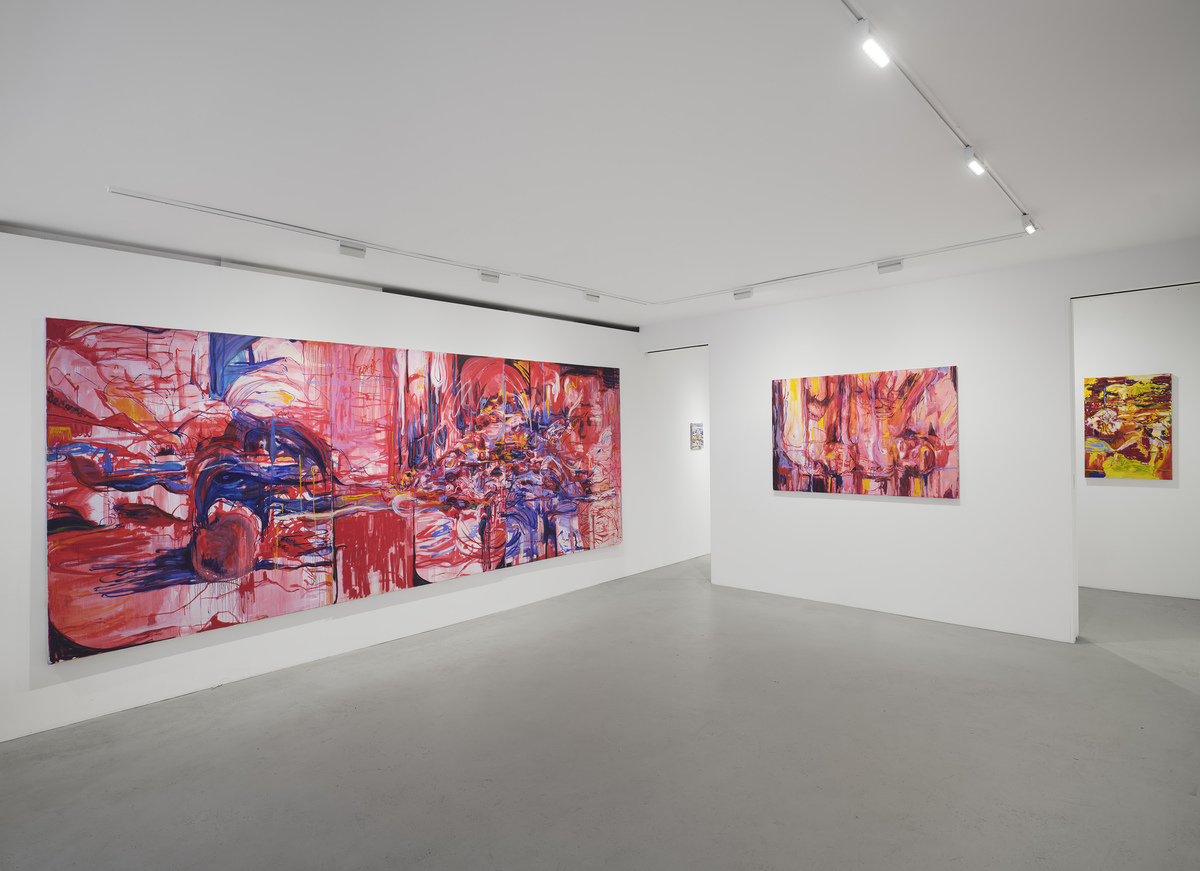 Installation view of Lewinale Havette: I Love It When You Beg at Palo Gallery. Image courtesy of the gallery.
Arguably, abstracted figuration can be an even more interesting form of storytelling than that of full-on figuration. The reasons for this being that abstraction becomes a screen or barrier that partially obfuscates what is occurring, thus necessitating a devoted attention to decipher the content. But abstraction is just as much tied to gesture and emotion, which is where paint, material, and process comes into play. As her second solo exhibition with Palo Gallery, Liberian artist Lewinale Havette’s paintings are emotively impactful scenes that touch on a multiplicity of themes ranging from the female body and queerness to West African and European cultural and spiritual synthesis.
About half of the gallery is overwhelmed by a jarring use of blood red in three massive paintings neighboring one another. The initial impression they give is one of closing in on the viewer’s personal space, practically getting claustrophobic given their spatial proximity. Physical encroachment aside, these fantastic paintings are rather visceral with their fleshy hues and smeared surfaces veiling a frenetic scene occurring within - possibly a decapitated head, a couple involved in passionate lovemaking, a nauseating pile of foodstuffs across a messy dinner table spread were among a few image associations that sprung to mind. Even the smaller works managed to vie for compelling emotional hooks with their drenched color schemes and violent mixtures of paints and marks.
 Lewinale Havette, Motion Over Narrative, oil on linen. 24 x 30 inches. Image courtesy of the gallery.
The ways in which Havette’s works brim with a sort of Pandora’s Box unleashed energy is reflective of the physically arduous process through which the artist completed these paintings. Faint traces of imagery quietly whisper through the onslaught of paints, only to disappear again when looking away for too long at the incredible level of detail surrounding it. Abrased surfaces were the product of carving and scraping with razor blades which, when seen amidst such shocking colors like blood red or sickly yellow, seems to produce a stinging sensation. It is as if Havette is not just attempting to invoke a particular emotion, but to allow the viewer to vicariously experience it themselves.
I appreciate it when the artist in question and the gallery do not overly explain nor give away the meaning or subjects behind the works, because it gives the viewer an opportunity to construct their own interpretation and narrative. And because Havette’s paintings are so visually engrossing, it is quite easy to be absorbed into them and lose awareness of the world around you.
Francine Tint: Open Color at A Hug from the Art World, Chelsea (on view through June 13, 2026)
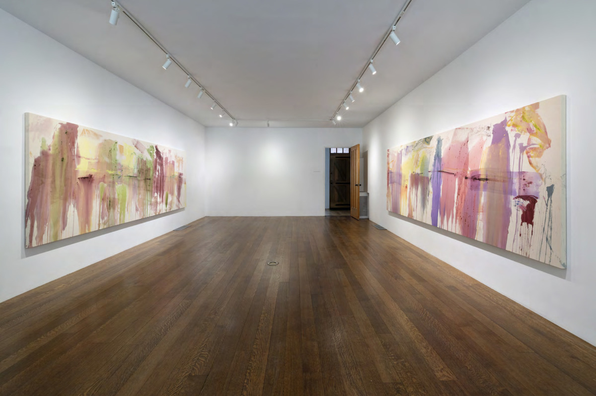 Installation view of Francine Tint: Open Color at A Hug from the Art World.
Hands down, Francine Tint has the best artist name ever. Her surname is literally the encapsulation of what she is about as a painter: color, through and through. Located in one of the most beautiful gallery spaces in all of Chelsea, Tint’s solo exhibition Open Color at A Hug from the Art World refers to her latest series on the synergistic relationship between paint and space.
Two longitudinal paintings greet viewers upon entering the homey first-floor of the townhouse-style gallery. They reel in the viewer with their streaky torrents of acrylic that are splattered all over their raw canvas surfaces. What is so attractive about these works is that these are lush displays of pale hues whose flowy orientations suggest a downwards gravitational pull of the paint while the artist worked. It only feels natural to take a top-down approach in studying them to keep up with the rhythm of Tint’s expressiveness. Additionally, the peering-in of negative space from behind the colorful brushstrokes in each enriches the dynamism within to the point where it feels like they have captured the sensation of raindrops hitting an absorptive ground.
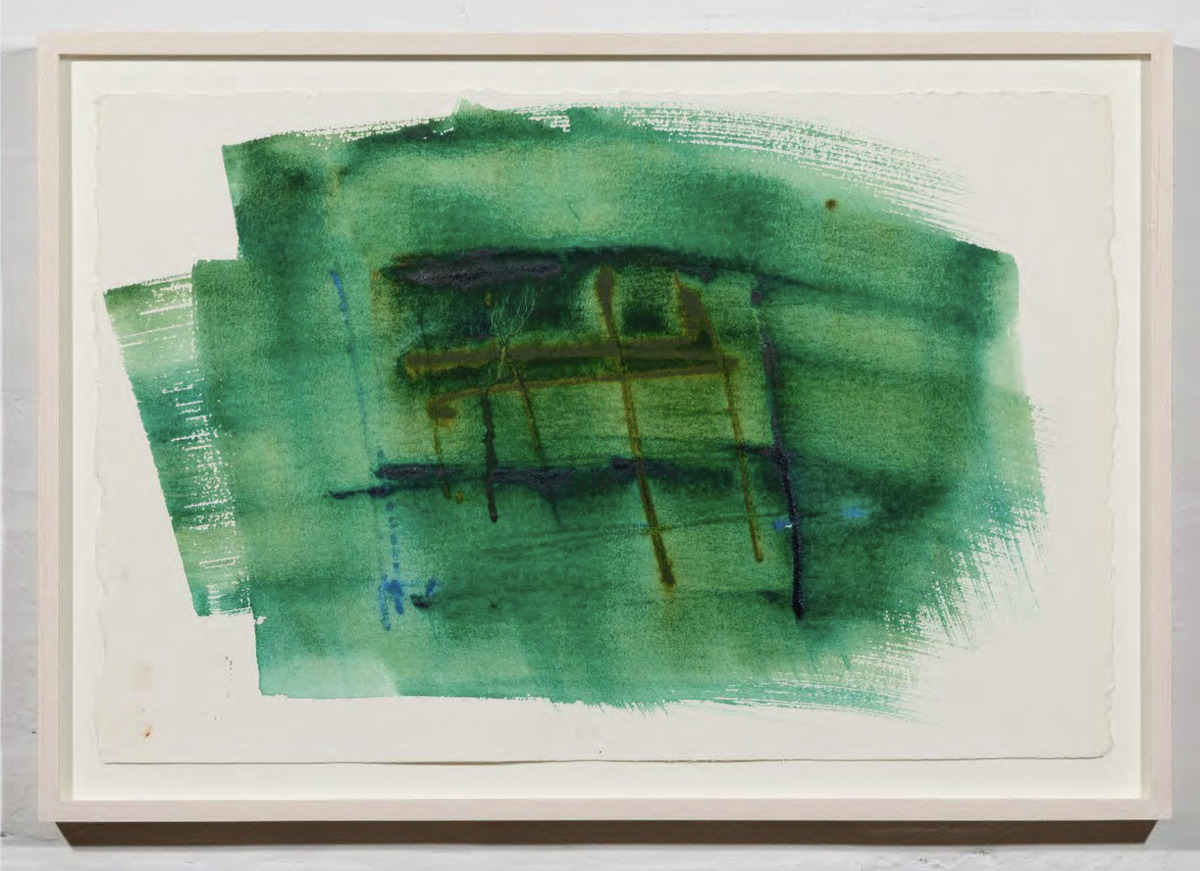 Francine Tint, Emerald City, 2026, watercolor on paper. 15 x 22 inches (38.1 x 55.9 cm). Image courtesy of the gallery.
In the even cozier upstairs space, much of the works here are a selection of watercolors on paper that thrum with concentrated doses of vital coloration. The seductiveness of color as a formal element certainly had its hold on me as the whimsically titled Emerald City, a name forever synonymous with The Wizard of Oz, beckoned my gaze as this is one of my favorite shades of green! There is an overlapping of thick emerald strokes in horizontal directions evened out by open spaces in the four corners of the paper. Subsequently, the final image loosely recalls the movements of a flag waving in the wind.
Just like the artist’s surname, Francine Tint’s Open Color lives up to its name with its bounteous spreads of colors that gush out in full glory. Though Color Field is one of the key influences that has shaped her work, clarification should be given here that a name like Open Color is even more apropos as “field” is suggestive of a certain groundedness, whereas Tint’s Open Color is even more expansive for the atmospheric weight such a title carries.
The Inheritance: From Ancient India to Minimalism at Helm Contemporary, The Bowery (May 8 - May 30, 2026)
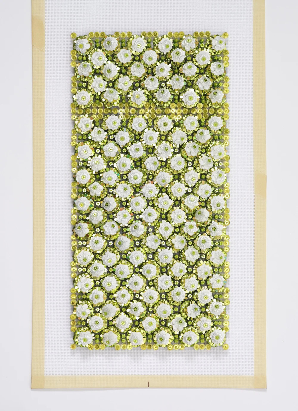 Devi Vallabhaneni, Study for Sovereignty, 2024, handmade French pailletes and Japanese glass in lacquered frame with Optium glass. 19 x 14 x 2.5 inches. Image courtesy of the gallery.
A classic Eurocentric Art History would typically look back to Ancient Greco-Roman texts that elucidate on ideal proportionality and mass such as Vitruvius’s De Architectura (On Architecture) or Pliny the Elder’s encyclopedic Natural History. However, a roughly contemporaneous text from a different side of the world - the Shilpa Shastras of ancient India - was an equally significant text of ancient design principles, which in this context was for Hindu temples and sculptures. Indian-American artist Devi Vallabhaneni’s wondrous solo exhibition at Helm Contemporary offered a freshly modern interpretation of such ideas as woven through a rich tapestry of stylistic influences, with a strong lean towards the Minimalism of Donald Judd and Agnes Martin.
Shimmery surfaces and elaborate pattern arrangements are the hallmarks of Vallabhaneni’s embroidered works, which involve the use of handmade French paillettes and Japanese glass. An endless network of shapes - much of which resembling the petals or bulbs of flowers - spring forth from the surface in dazzling glows of white over green backgrounds. These marvelously bejewelled compositions not only impress in their ability to conceive a pulsating relationship between two- and three-dimensionality, but to also capture the essence of traditional Indian carpet designs. Just like Indian carpets, one could make the argument that Vallabhaneni’s astute command of her materials exudes a skillfulness commensurate with what is required of a weaver’s expertise in distinguishing their warps from their wefts.
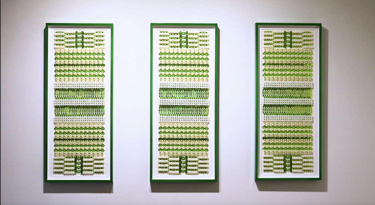 Devi Vallabhaneni, Generations, 2026, handmade French paillettes, Japanese glass beads, and compressed cotton pearls in a metal frame with Optium glass. Image courtesy of the gallery.
When thinking about the design principles of India compared to Greece and Rome of Antiquity, an ostentatiousness of surface was a key criterion, to which Vallabhaneni executed in a most impeccable manner through her expert-level knowledge of the algorithmic sequencing of patterns and forms.
N. Dash: Geophilia at Hill Art Foundation, Chelsea (on view through July 31, 2026)
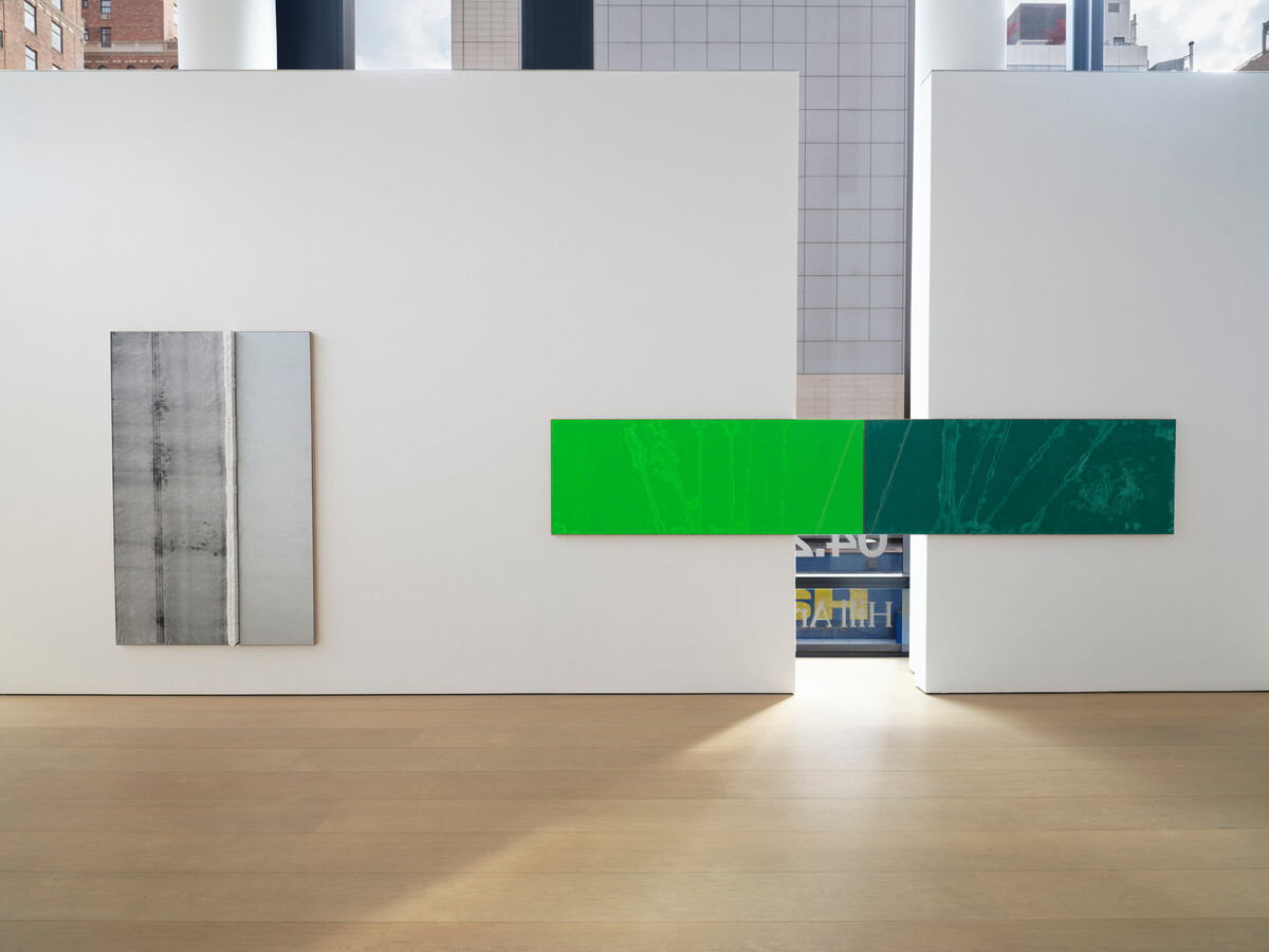 Installation view of N. Dash: Geophilia at Hill Art Foundation. Image courtesy of the gallery.
N. Dash (b. 1980) is probably one of the more enigmatic abstract artists in contemporary painting. Mystery finds itself in Dash’s works whose titles do not give away much based on their abbreviated nomenclature such as DR_25 or OGN_26. Aside from figuring out the numbers correspond to the year of creation, the almost veil of secrecy attached to their names is reinforced by the artist’s austere and clean aesthetic distinguished by an economical use of materials and compositional openness. Yet, this minimalist expression is a far more sophisticated system that may initially come across as coldly industrial or mechanistically vacuous, but is actually quite full and closely linked to the natural world.
Breaking down the title of the exhibition, Geophilia, the prefix refers to “earth”, while the suffix is “loving”. When put together, N. Dash is declaring a love for the earth. Thinking back to modernists like Lucio Fontana or Mark Rothko, each saw the potential for painting to be a portal into infinite space rather than a flattened surface where pigments only rested. Dash, too, is accomplishing something similar through an abstraction that gives an atmospheric glimpse into a monumental beyond. The frequent presence of horizontally-oriented paintings like RCU_25 instantaneously evoke the idea of a horizon line, which in this case, is richly satisfied by the split, diptych arrangement of two vibrant shades of green associative of a verdant landscape.
Earth as a material is literally brought into conversation as it is integrated within just about every work in Geophilia. Though some of these paintings may give an impression of artificiality with their metallic-looking appearances or the mostly white-grey-black colors that dominate, the earth is intrinsic to their very existence. Being reminded of this detail, these works suddenly lose the sterility and harken back to the land itself - black becomes associative with obsidian or volcanic rock, white echoes the blinding sight of tundras, and grey speaks to metal as a natural occurrence rather than an agent of industrial production.
As a bonus, N. Dash's paintings are situated within an art historical lineage of artists with similar interests in materiality and form, which are as divergent as one of Andy Warhol's oxidized painitngs to a 16th Century Italian bronze. N. Dash: Geophilia is a meditative experience that has managed to prove itself as a great and unique example of where abstract art can be effectively political. WM

Liam Otero
Liam Otero is a freelance art writer in NYC. He was recently named New York Editor of Whitehot Magazine.
view all articles from this author


