Whitehot Magazine
January 2026
"The Best Art In The World"
"The Best Art In The World"
January 2026
December 2008, William Steiger @ Margaret Thatcher Projects

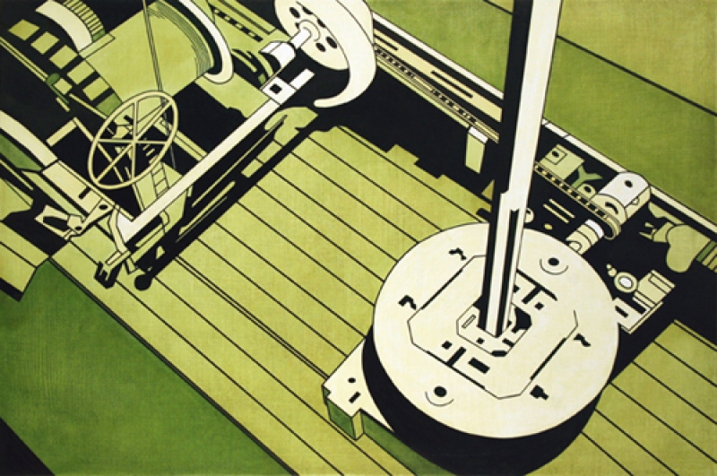
William Steiger, Green Machine, courtesy Margaret Thatcher Projects
William Steiger: Transport at Margaret Thatcher Projects
What stick out in a William Steiger painting are, of all things, the textures. At first viewing, this seems like an absurdity. After all, his work stands up on its own two feet by way of the exploration of geometric forms, negative space, and slabs of solid colors. These are the elements of Steiger's work that burn themselves into one's retinas and have burned themselves into the art press.
Returning for a third time to Margaret Thatcher Projects, however, I gave myself as long as I needed to apprehend the paintings and attempt to evoke understanding that hadn't been utilized a million times before. I looked closer. I stuck my face a foot away from each piece and saw a base of ribbed, flowing, undulating texture. Each work was rife with it.
At the outset, the base primer to each painting is done with a thick agent, and the brush strokes are somewhat chunky. They are, actually, quite obvious even from a few feet away.
But there are additional textures. In Blue Machine they are the most obvious. Each element contains an individuated texture, cordoned-off by the strict parameters that define Mr. Steiger's work. Blue Machine and, to a slightly lesser extent, Green Machine, are set apart from the others in this way quite radically.
On the other end of the spectrum, the paintings of buildings, Wheat Pool #12, Wheat Pool II and Wheat Pool #11 have the least. In fact, the only non-homologous surfaces are the background bases, on the canvas itself. Another work low on texture save for the background is Gondola Wheel II.
In the paintings containing tramcars and railroad cars, however, the texture, only showing up in the representation of windows, throws the rest of each of these pieces into sharp relief.
Besides the background base in Cable Car Blue, Cable Car Violet, Aerial Tramway Green, Aerial Tramway Blue, Caboose Baywindow and Tanker Car, these areas of texture were, at a medium distance, the first things I noticed. They contrast with the other elements of solid, full hues, vast, white negative space and geometric-perfect lines.
For me the textured elements, like negative space, throw the surrounding areas into sharp relief. The white negative spaces, in regards to the cable car and tramcar paintings, do the same thing. Each streaked window and white space shine a high-powered light beam at the raw geometry of colors. To me, these elements, at least in this show, TRANSPORT, re-establish Mr. Steiger as both a master of balance and a forward-thinking artist who is taking solid, important steps forward in his work.

Hans Michaud
Hans Michaud is a freelance journalist in New York.
SEND THIS WRITER A MESSAGE:
| hansmichaud@gmail.com |


